

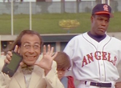
The Angels have had a lot of hats. While experimenting with ten different logos, they've messed with Capital A's, lower case A's, halos, wings, three color schemes and multiple cities. Out of them all, I can confidently state that this Anaheim Angels lid is my favorite.
Sandwiched between the styles of the California Angels in the Outfield and the new-age identity crisis between Anaheim and Los Angeles, this logo shined during the first few years of Disney ownership from 1997-2001- or the "Mo Vaughn Era" as I like to call it.
Admittedly I wish the logo was a tiny bit smaller, but all in all this is a great hat. I really like the implementation of their periwinkle baby blue, and I think the winged 'A' is both a stylish and smart play on the name Angels.
My love for this hat also stems from the fact that it was used for such a short amount of time. While some may forget this logo ever existed, I can picture the likes of Darin Erstad and Jim Edmonds sporting it proudly.
Although the Angels have had plenty of great looks over the years, the original Anaheim Angels cap sticks out in my mind as the best of the bunch.
Previous Hats of the Week
Charlotte Stone Crabs
Superbowl Special (Pittsburgh Pirates & Milwaukee Brewers)
Lehigh Valley Ironpigs
Chattanooga Lookouts
Corpus Christi Hooks
Montgomery Biscuits
No comments:
Post a Comment