Showing posts with label Hat of the Week. Show all posts

Sunday, April 24, 2011

MLU's HAT OF THE WEEK: Norfolk Tides


It's pretty much been established: any team sporting light blue on their cap will be featured on Hat of the Week. It's one of the best colors going, and combining it with other forms of blue - in this case, royal and navy - makes the look even better. In this case, it's simply a bonus that the Norfolk Tides happen to have one of the best logos in the game as well.

I mean, if the color scheme alone didn't have you standing and applauding, how about capping the "T" with a wave? Just sheer genius. Somewhere the designers of this logo are feeling pretty good about thesmelves.

This hat has all the criteria one could ask for looks wise - but, as the 3-13 Tides can attest to, a sharp hat doesn't win you any ball games. (Although I wouldn't be surprised if two of those wins had something to do with the hat.)

*The Norfolk Tides are a Triple-A affiliate of the Baltimore Orioles.

In case you missed it, check out SMALLS TALK: Minor League Hats are the Way to Go

Previous Hats of the Week
Arizona State Sun Devils
Fort Wayne TinCaps
Texas Longhorns
Auburn Doubledays
Houston Astros
Lancaster Jethawks
Anaheim Angels
Charlotte Stone Crabs
Superbowl Special (Pittsburgh Pirates & Milwaukee Brewers)
Lehigh Valley Ironpigs
Chattanooga Lookouts
Corpus Christi Hooks
Montgomery Biscuits

Thursday, April 7, 2011

MLU's HAT OF THE WEEK: Arizona State Sun Devils


I love a good alternate cap. Over the course of a long season, it's always nice to mix things up - and that's exactly what the Arizona State Sun Devils do with their secondary logo: the pitch fork.

Lettered logos can be timeless, but they don't get me going like this kind of play on a mascot. They could have easily decided to go with the school's other logo - the mustachioed running Sun Devil - but instead, they went next level on us. The pitch fork is sharp - (couldn't resist) - and represents the Sun Devils with a certain subtlety that leaves me nodding in approval.

Mix in a classic color scheme and you've got a winner of a hat - it's no wonder they're a mainstay in Omaha.

*In case you missed it, check out MiLB LIFE: Wasted Hat Collection

Previous Hats of the Week
Fort Wayne TinCaps
Texas Longhorns
Auburn Doubledays
Houston Astros
Lancaster Jethawks
Anaheim Angels
Charlotte Stone Crabs
Superbowl Special (Pittsburgh Pirates & Milwaukee Brewers)
Lehigh Valley Ironpigs
Chattanooga Lookouts
Corpus Christi Hooks
Montgomery Biscuits

Monday, March 28, 2011

MLU's HAT OF THE WEEK: Fort Wayne TinCaps


This logo makes me laugh. An apple wearing a kitchen pot on its head - or is it a pan? Either way - only in Minor League Baseball.

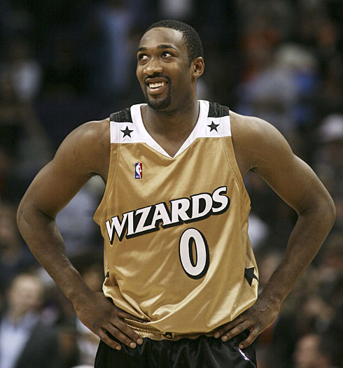
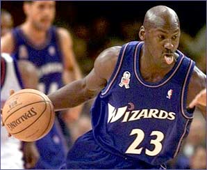
The MiLB team in Fort Wayne, Indiana went from the "Wizards" to the "TinCaps" in 2008, and I must say, I'm a fan of the name change. As whimsical and fun as the idea of a wizard may be, it leaves a little something to be desired as a mascot. Instead of thinking magic and Merlin, I think Gilbert Arenas - or even worse, MJ version 3.0. The word has lost its magic - not to mention, the whole Harry Potter craze has made wizardry more mainstream than Justin Beiber. I'm just thankful they didn't become the Fort Wayne 'Vampires'.

The upgraded name brought a new and improved look along with it. The new logo is both simple and unique, while evoking a certain Dennis the Menace type innocence. Throw this trouble-making apple on a nice green hat, and the fans in Fort Wayne have got themselves a nice new lid to wear to the ball park.

The TinCaps. Who comes up with this stuff?

*The Fort Wayne TinCaps are a single-A affiliate of the San Diego Padres.

In case you missed it, check out SMALLS TALK: Minor League Hats Are the Way to Go

Previous Hats of the Week
Texas Longhorns
Auburn Doubledays
Houston Astros
Lancaster Jethawks
Anaheim Angels
Charlotte Stone Crabs
Superbowl Special (Pittsburgh Pirates & Milwaukee Brewers)
Lehigh Valley Ironpigs
Chattanooga Lookouts
Corpus Christi Hooks
Montgomery Biscuits

Tuesday, March 22, 2011

MLU's HAT OF THE WEEK: Texas Longhorns


Hat of the Week has finally made its way into the college ranks, and Austin, Texas is the perfect place to start.

Despite winning six national championships and launching a small army of ballplayers into the Big Leagues, it's the Texas Longhorns' uniforms that have baseball fans intrigued.

No other school in the country has been able to completely monopolize a color like the 'Horns have done with Burnt Orange. The color is crisp, and has become synonymous with both the school and the state- not to mention it can really pack a punch when mixed with one of the most recognizable logos in all of sports.

Athough the team is usually seen sporting its trademark white hat with the Capital 'T' emblem, their all-orange cap partnered with the classic Longhorn logo gets the edge in my book.

Ladies and gentlemen, MLU's first NCAA selection for Hat of the Week. Congratulations to Bevo- what a pioneer!

Previous Hats of the Week
Auburn Doubledays
Houston Astros
Lancaster Jethawks
Anaheim Angels
Charlotte Stone Crabs
Superbowl Special (Pittsburgh Pirates & Milwaukee Brewers)
Lehigh Valley Ironpigs
Chattanooga Lookouts
Corpus Christi Hooks
Montgomery Biscuits

Monday, March 14, 2011

MLU's HAT OF THE WEEK: Auburn Doubledays


I have not exactly been subtle about my appreciation for red hats. They're my favorite. They stand out without being too obnoxious, and in my opinion, the loud color evokes a certain air of confidence. Partner it with a solid logo and you've got yourself a pretty sharp lid, my friend.

That's what we have here with the Auburn Doubledays. This is a hat that could only be found in the Minor League ranks. While Big League emblems appear more simple and professional, the Minors have a little more fun with their logos. And what better way to pay tribute to the alleged creator of our favorite sport than by throwing a ball cap and an oversized mustache onto a Capital 'A'?

This one's for Abner!

*The Auburn Doubledays are a single-A short-season affiliate of the Washington Nationals.

In case you missed it, check out SMALLS TALK: Minor League Hats Are the Way to Go

Previous Hats of the Week
Houston Astros
Lancaster Jethawks
Anaheim Angels
Charlotte Stone Crabs
Superbowl Special (Pittsburgh Pirates & Milwaukee Brewers)
Lehigh Valley Ironpigs
Chattanooga Lookouts
Corpus Christi Hooks
Montgomery Biscuits

Sunday, March 6, 2011

MLU's HAT OF THE WEEK: Houston Astros


In a world where orange hats are really hit or miss, this classic Astros lid would qualify as a hit. It's loud color is offset by the simplicity of the logo, and even though I don't own one article of orange clothing, I can't help but think I would look pretty sharp sporting this timeless cap- who wouldn't?

I gotta give it to the Astros- in the 9 week history of MLU's Hat of the Week, they've been associated with one-third of the lids featured. They've got some style down there in Houston- although, don't look for their current Big League hat to be our Sunday feature anytime soon.

Why do so many teams ditch such classic looks? 

*In case you missed it, check out MiLB LIFE: Wasted Hat Collection

Previous Hats of the Week
Lancaster Jethawks
Anaheim Angels
Charlotte Stone Crabs
Superbowl Special (Pittsburgh Pirates & Milwaukee Brewers)
Lehigh Valley Ironpigs
Chattanooga Lookouts
Corpus Christi Hooks
Montgomery Biscuits

Sunday, February 27, 2011

MLU's HAT OF THE WEEK: Lancaster Jethawks


This is a sharp lid. I'm a huge red hat guy, and the Lancaster Jethawks have a winner with this one. I love the shield-like emblem and they've got a great color scheme going on- the subtle light blue trimmings work great with the dark red.

The hawk looks stoic in his pose, and the red and blue splattered logo reminds me of those HOPE Obama posters, which I always thought were pretty sharp looking- yet somewhat misleading.

*The Lancaster Jethawks are a Single-A affiliate of the Houston Astros.

In case you missed it: SMALLS TALK: Minor League Hats are the Way to Go

Previous Hats of the Week
Anaheim Angels
Charlotte Stone Crabs
Superbowl Special (Pittsburgh Pirates & Milwaukee Brewers)
Lehigh Valley Ironpigs
Chattanooga Lookouts
Corpus Christi Hooks
Montgomery Biscuits

Sunday, February 20, 2011

MLU's HAT OF THE WEEK: Anaheim Angels


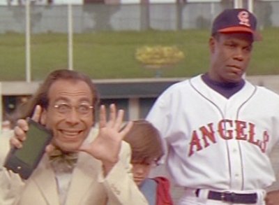
The Angels have had a lot of hats. While experimenting with ten different logos, they've messed with Capital A's, lower case A's, halos, wings, three color schemes and multiple cities. Out of them all, I can confidently state that this Anaheim Angels lid is my favorite.

Sandwiched between the styles of the California Angels in the Outfield and the new-age identity crisis between Anaheim and Los Angeles, this logo shined during the first few years of Disney ownership from 1997-2001- or the "Mo Vaughn Era" as I like to call it.

Admittedly I wish the logo was a tiny bit smaller, but all in all this is a great hat. I really like the implementation of their periwinkle baby blue, and I think the winged 'A' is both a stylish and smart play on the name Angels. 

My love for this hat also stems from the fact that it was used for such a short amount of time. While some may forget this logo ever existed, I can picture the likes of Darin Erstad and Jim Edmonds sporting it proudly.

Although the Angels have had plenty of great looks over the years, the original Anaheim Angels cap sticks out in my mind as the best of the bunch.

Previous Hats of the Week
Charlotte Stone Crabs
Superbowl Special (Pittsburgh Pirates & Milwaukee Brewers)
Lehigh Valley Ironpigs
Chattanooga Lookouts
Corpus Christi Hooks
Montgomery Biscuits

Sunday, February 13, 2011

MLU's HAT OF THE WEEK: Charlotte Stone Crabs


This is a great hat. Not too flashy- simplicity and subtlety at its finest. The Charlotte Stone Crabs have a great color scheme, and they let the powder blue and navy combo do the talkin'. Add a plain 'C' and an accompanying crab claw and you've got yourself a classic looking lid.

Now if only the Rays would take a peek at the style being displayed in their farm system, they'd have their hands on a pretty respectable alternate cap.

*The Charlotte Stone Crabs are a single-A affiliate of the Tampa Bay Rays.


Previous Hats of the Week
Superbowl Special (Pittsburgh Pirates & Milwaukee Brewers)
Lehigh Valley Ironpigs
Chattanooga Lookouts
Corpus Christi Hooks
Montgomery Biscuits

Sunday, February 6, 2011

MLU'S HAT OF THE WEEK: Superbowl Special

In honor of the most viewed program in television history, MLU opted to throw a little Superbowl spin on this Sunday's Hat of the Week.

Now before you  yell "Objection" to the fact that neither of these hats is of the Minor League ranks, keep in mind that the feature is called "Hat of the Week" - not "Minor League Hat of the Week"- so all hats from any baseball level are fair play. 

Sure, MiLB lids happen to be my favorite, but, there are a lot of great caps out there- NCAA, MLB, World Baseball Classic, Independent Leagues, college summer leagues, etc.- and MLU will do its best to bring them all to you.

Now, on to our featured items:


Our first hat screams Steel City. The yellow Pirates hat is a classic look, one that I wish the modern-day Bucs would adopt as a consistent throwback cap. Simple in its colors and style, the Pirates represent a unique city whose triumvirate of sports team all wear the same colors. Whether you're cheering on the Penguins, Steelers, or Pirates, Pittsburgh bleeds Black and Yellow.

Hat #2 could be one of my favorite hats of all time. Even when I thought it was simply a glove on the front, I liked this Brewers throwback because of the colors and the simplicity. But then I discovered that I had overlooked one of the greatest logos of all-time- how could I have missed that? That's not merely a glove, that is an M and a B! I was amazed. This is one of the most cleverly constructed logos in sports, and I'm glad to see the Brew-Crew has come to their senses and started wearing this old hat and colors again- why they strayed from it in the first place? The world may never know.

*Yes, I'm well aware the Brewers are from Milwaukee, not Green Bay- but I'm playing the odds that all Wisconsin natives are Cheese Heads.

I hope everyone enjoys their Superbowl Sunday- win or lose, remember: it's all about the food.

Previous Hats of the Week
Lehigh Valley Ironpigs
Chattanooga Lookouts
Corpus Christi Hooks
Montgomery Biscuits

Sunday, January 30, 2011

MLU's HAT OF THE WEEK: Lehigh Valley Ironpigs


I am a big fan of the red hat. It sticks out- loud, but in a good way. And the Lehigh Valley Ironpigs sport one beauty of a red hat. The pig nose is classic and the angry eyes let you know this swine means business.

Voted Best Logo in Minor League Baseball by several completely unofficial polls last year, this popular logo combines with a great color scheme to give the Ironpigs the nod for this sunday's Hat of the Week. 

*The Lehigh Valley Ironpigs are a Triple-A affiliate of the Philadelphia Phillies.

In case you missed it, check out SMALLS TALK: Minor League Hats are the Way to Go

Previous Hats of the Week
Chattanooga Lookouts
Corpus Christi Hooks
Montgomery Biscuits

Sunday, January 23, 2011

MLU's HAT OF THE WEEK: Chattanooga Lookouts


The Chattanooga Lookouts put a minor league spin on my favorite Phillies lid in this edition of Hat of the Week. Blue and red are a fool-proof color scheme, and the playful logo is a classic minor league play on a team's name.

The 'C' combined with the droopy but watchful eyes makes for one of my favorite logos in the MiLB ranks. This hat is stylish, and also serves as a great conversation starter- two of the biggest criteria when determining Hat of the Week.

So next time you find yourself in a hat store, keep a 'look out' - (couldn't resist) - for this fan favorite.

*The Chattanooga Lookouts are a Double-A affiliate of the Los Angeles Dodgers.

(In case you missed it, check out SMALLS TALK: Minor League Hats are the Way to Go)

Previous Hats of the Week
Corpus Christi Hooks
Montgomery Biscuits

Sunday, January 16, 2011

MLU's HAT OF THE WEEK: Corpus Christi Hooks


I've always been a sucker for the navy and light blue combo. The Corpus Christi Hooks have a winner with this home cap- great colors complemented by a fun logo: the staples of a good Minor League hat. 

Is it me or does that little guy look more cute than intimidating? Kind of a little brother 'trying to prove himself' type of look he's got goin' on- maybe it's just the way he's wearing his little red hat. Either way, this Hooks lid is one of my favorites.

*The Corpus Christi Hooks are a Double-A affiliate of the Houston Astros.

(In case you missed it, check out SMALLS TALK: Minor League hats are the way to go)

Previous Hats of the Week
Montgomery Biscuits

Sunday, January 9, 2011

MLU's HAT OF THE WEEK: Montgomery Biscuits
Looking for a fresh new look? Introducing MLU's Hat of the Week. Every Sunday we will showcase a favorite lid from the Major League, Minor League, or College ranks. These are personal favorites, sure to catch the attention of any baseball fan or female observer.

New Era MiLB 59Fifty Caps

I cannot look at this hat without smiling. The Montgomery Biscuits alternate hat is hilarious, take a peek: it's literally a biscuit- buttered in the middle, of course- with eyeballs, big white gloves, and a pair of spikes. Come on, that's classic.

The logo is fun and I like the navy and yellow combo: eye-catching, but in a subtle way. Most importantly, this hat is a conversation-starting machine. Who is going to see this hat and not 1) chuckle, and 2) ask what team it is? Better yet, anyone who knows what hat you're wearing, regardless of whether you know the person or not, is gonna greet you with a "Montgomery Biscuits!" and a high-five. It simply can't miss.

*The Montgomery Biscuits are a Double-A affiliate of the Tampa Bay Rays.

(In case you missed it, check out SMALLS TALK: Minor League hats are the way to go)